Brand & Design
CX, UX & UI
Written by Jeff Lombard · Last Updated:
Download PDF
Most organizations don’t have a design problem.
They have a vocabulary problem.
Ask ten people to define Customer Experience (CX), User Experience (UX), and User Interface (UI), and you’ll likely hear ten different answers. The terms are used interchangeably, responsibilities blur across departments, and teams end up optimizing isolated pieces of a system rather than the system itself.
The result is predictable.
Marketing creates a compelling promise. Product builds a polished interface. Customer support works overtime to fix the gaps between them.
Everyone is doing good work.
The customer still has a bad experience.
The distinction between CX, UX, and UI isn’t academic. It’s one of the most useful mental models for understanding where friction comes from and how to remove it.
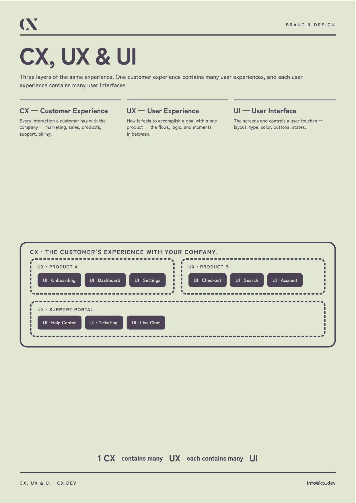
As our handout illustrates, these disciplines are nested inside one another. A customer experience contains many user experiences, and each user experience contains many user interfaces.
UI: The Interface
User Interface is the layer most people think about when they hear “design.”
Buttons.
Typography.
Spacing.
Colors.
Animations.
Forms.
Icons.
These are all UI decisions.
Good UI makes software easier to read, faster to navigate, and more pleasant to use. Bad UI introduces unnecessary cognitive load. Users hesitate because they don’t know what something means or where they should click next.
UI matters.
But it is also the easiest part to overvalue.
A beautiful dashboard cannot compensate for a workflow that makes no sense. A modern design system cannot hide a fundamentally broken process.
UI is what people touch. It is not what they experience.
UX: The Journey
User Experience is what happens while someone tries to accomplish a goal.
Can they find what they need?
Do the steps feel obvious?
Are errors recoverable?
Does the product respect their time?
Every screen is merely one moment inside a larger journey.
Imagine booking a medical appointment.
One screen lets you choose a date.
Another confirms insurance.
Another sends reminders.
Another lets you reschedule.
Each screen has its own UI.
Together they create one UX.
Great UX minimizes effort. Users don’t notice it because everything feels inevitable. They simply reach their goal with very little friction.
Poor UX is different.
People don’t necessarily complain that your navigation is wrong. They simply abandon the task.
CX: The Whole Relationship
Customer Experience begins long before someone opens your product.
It starts with marketing.
Sales conversations.
Pricing.
Contracts.
Onboarding.
Documentation.
Support.
Billing.
Renewals.
Even how invoices look contributes to Customer Experience.
Every interaction shapes trust.
This is why companies with mediocre software sometimes outperform technically superior competitors. Their customers feel understood before they ever log in.
Likewise, companies with exceptional software often struggle because every interaction surrounding the product creates unnecessary friction.
Support doesn’t answer emails.
Sales overpromises.
Implementation takes months.
Invoices are confusing.
Customers don’t remember individual moments. They remember how working with you felt.
That is Customer Experience.
The Hierarchy Matters
The easiest way to understand these concepts is as a hierarchy.
A company has one customer relationship.
Inside that relationship are multiple products and services.
Inside each product are dozens—or hundreds—of interfaces.
You cannot improve Customer Experience solely by redesigning screens.
Nor can you fix poor UX with prettier buttons.
Every layer depends on the layer beneath it while contributing to the layer above it.
When organizations recognize this hierarchy, conversations become dramatically more productive.
Instead of saying,
“We need better UX.”
they can ask,
“Is this actually a UX problem, or are customers frustrated because our onboarding process starts before implementation is complete?”
Those are very different problems.
The Cost of Optimizing the Wrong Layer
One of the most common mistakes we see is organizations investing heavily in UI improvements while ignoring operational friction.
A redesigned dashboard.
A refreshed logo.
New colors.
Modern typography.
Meanwhile customers still wait two weeks for an implementation call.
Invoices still require manual correction.
Support tickets bounce between departments.
None of those problems are visual.
They’re systemic.
Design cannot compensate for operational dysfunction.
Likewise, engineering cannot solve a broken customer promise.
If Marketing says setup takes five minutes while implementation actually takes five days, no amount of interface polish will repair the resulting loss of trust.
Designing Systems, Not Screens
At CX.dev, we think about design differently.
We don’t start with pixels.
We start with outcomes.
What promise are we making?
What journey does the customer take?
Where are they forced to wait?
Where are they confused?
Where do they repeat work?
Only after answering those questions do we think about interfaces.
Because interfaces are simply the visible parts of a much larger system.
The best products rarely have spectacular UI.
They have almost invisible friction.
Everything feels obvious because every layer—from marketing to onboarding to support to product design—has been intentionally aligned.
Customers don’t separate these experiences into departments. Neither should you.
Final Thought
UI determines how someone interacts with a screen.
UX determines how someone accomplishes a task.
CX determines how someone remembers your company.
Companies that understand only UI build attractive software.
Companies that understand UX build usable software.
Companies that understand CX build businesses customers want to return to.